![ITONICS-Logo-Night-Blue-2021.svg]](https://www.itonics-innovation.com/hubfs/ITONICS-Logo-Night-Blue-2021.svg)
When you define your custom element types or simply want to know what options you have to classify, structure, visualize, and compare content, you need to know the difference between the different property types:
|
1. Rich Text 2. Dropdown 4. Rating |
7. Number 8. Date 9. Hyperlinks 10. User Fields 11. Attachments |
If you are interested in creating your custom properties or changing them, please read this article: Structuring Content via Element Types: The Element Configuration
Where to create properties
To create a new property, navigate to the element configuration, then to
- Element type to be edited
- Find where you want to use/create the new property, press on "+".
- Press "create new property".
- Select the property type.
The next sections will focus on explaining all available entity types and their use cases.
Rating properties can only be created and inserted in the "Rating" block, they are separate from the other properties.
Properties are cross element type.
Changing an existing property will affect this property across all element types in the particular workspace and change all affected elements!
Be mindful when editing.
AI powered RTE — rich text fields
RTE fields are AI powered with Prism (and powered by tip-tap, for the technical readers) and can be used for nearly everything, style your text with headings (H1–H3), bold, italic, strikethrough, subscript, superscript, and underline styles, links, code blocks, quote blocks, different text align styles, highlighting, text coloring, bullet-, ordered-, task-lists, notifications bars, dividers, tables, pictures, videos, files and embeds and reference elements with "#".
Prompt Prism for virtually anything and it will, even context aware, do it:
Prompted to write RTE to put here with information on all the supported RTE features.

And the result:

Note: There is a character limitation of 31772 characters on Rich Text Fields.
Dropdowns

The dropdown property includes:
-
Property name
-
Multiple values checkbox
-
Required
Information then needs to be added before the element can be created. To do so, check the "Always require a value" toggle. -
Dropdown-options
Click on Add option to enter more options.The dropdown-options themselves can be:
-
Reorder
-
Delete
-
Change color (eleven predefined, color picker, or enter hex value)
-
-
Save
To save the new property
Two visualizations
Dropdown fields can be displayed in two different ways.
As dropdown:

And as steps:
 Hierarchical dropdown

Definition
The hierarchical dropdown property includes:
- Property name
- Multiple values checkbox
- Required
Information then needs to be added before the element can be created. To do so, check the "Always require a value" toggle. - Dropdown-options
Click on Add option to enter more options.
The dropdown-options themselves can be:
- Reorder
- Delete
- Change color (11 predefined, color picker, or enter hex value)
- Add another dropdown layer (nested)
Press "+" next to the dropdown-option name
- Save
To save the new property
The hierarchical dropdown property type is perfect for segmenting elements for display on Radars views.
E.g. both the Trend Radar and Technology Radar use the hierarchical dropdown property for segmentation.
Visualization
Used in all of ITONICS' radar views.
In the element card, show like below.

Rating
To collect feedback from lots of people and to condense it as much as possible, a rating property makes a lot of sense. Ratings can be set on any element type there is, they also come included in the predefined ITONICS element types.
Definition
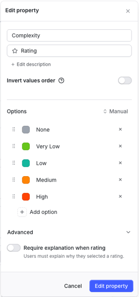
The standard rating property includes:
- Property name
- Read-only
When enabled, users can view ratings but cannot submit or change their own rating for this property. - Rating-options
Click on Add option to enter more options.
The rating-options themselves can be:
- Reorder
-
- Delete
-
- Change color (11 predefined, color picker, or enter hex value)
- Invert values order
When inverted, visualizations will flip the order of values of this property by default. - Require explanation when rating (Advanced)
When enabled, raters must provide a written explanation before their rating can be submitted. - Save
To save the new property
Furthermore, the purpose of the rating is to collect opinions from evaluators on the element.
- Pre-definition prevents users from adding invalid options
- Can be selected in radar, matrix, and board as visual indicators (e.g., segment, columns, swimlanes, axes, color, distance, halo, or donut).
- Can be filtered from "more filters"
- Individual ratings can be seen by clicking on the "person + number" icon
Visualization
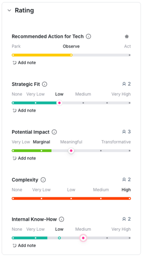
Rating properties in the element card are displayed as a horizontal colored bar. The rating option labels are shown above the bar, and the currently selected value appears in bold. To submit or change a rating, click the desired position on the bar. To remove a rating, click the current value label on the bar - a tooltip showing the selected value with an × appears. Click the × to un-rate. Each rating criteria also shows an Add note button, allowing raters to attach a written explanation to their selection.
For regular ratings (as opposed to numerical ones, see below), the average will be rounded to the next full value.
Note as well that the rating average is calculated as a percentage of the total number of rating-options and it is not influenced by its rating-option-names.
This means, when hovering over a regular rating to see its average, encountering a different number than when calculating it yourself with the rating-option-names, is expected.
Internally, every rating-option is mapped to an integer value starting from zero, then every user-rating is added up, divide by the total number of user ratings and divided again by the number of rating-options minus one (to get an accurate visual representation):
E.g.: for a regular rating with
rating-options: "low" = 0, "medium" = 1, "high" = 2,
user-ratings: 2x low, 1x medium,
the average would be:
(0 + 0 + 1) / 3 = 1/3 [= 0.33]
0.33 / [total number of rating options - 1] = 0.33 / 2 = 16.5%.
Numerical Rating
Sometimes a rating not by text, but with a number is needed, that is why ITONICS introduced the numerical rating.

Definition
The numerical rating property includes:
- Property name
- Rating range
Specify the range
- Invert values order
When inverted, visualizations will flip the order of values of this property by default.
- Save
To save the new property
Furthermore, the purpose of the rating is to collect opinions from evaluators on the element.
- Pre-definition prevents users from adding invalid options
- Can be selected in radar, matrix, and board as visual indicators (e.g., segment, columns, swimlanes, axes, color, distance, halo, or donut).
- Can be filtered from "more filters"
- Individual ratings can be seen by clicking on the "person + number" icon
Visualization
In the element card a numerical rating looks like this.

When multiple users evaluate an element, we will calculate the average of those evaluations. For numerical ratings, we do not round the results to the next full value, but rather work with decimal numbers - both in the rating widget and in any visualization.
Aggregated Rating
Based on the individual rating criteria, you can build an index that aggregates the values of at least two rating criteria into one value.
Definition
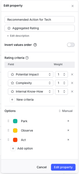
The aggregated rating property includes:
- Property name
- Rating properties & weight
Select all the standard rating properties you want to aggregate over and select a weight - Rating-options
Click on Add option to enter more options.
The rating-options themselves can be:
- Reorder
-
- Delete
- Invert values order
When inverted, visualizations will flip the order of values of this property by default. - Save
To save the new property
The permissions to view the aggregated rating criteria described in the following article: general permission to view ratings.
Visualization
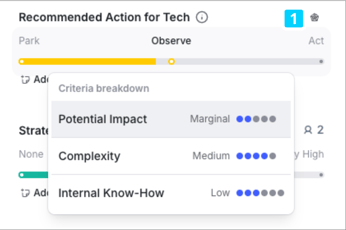
On a content card, the aggregated rating is displayed as a horizontal colored bar with a Rating analysis icon [1] next to the criteria name. Clicking the Rating analysis icon opens the Rating analysis modal.
Note
- Select at least two rating criteria
- If you add another rating criteria later to an aggregated rating, you need to manually add this new rating criteria to the element form and the rating group. If you start directly the configuration of the rating group with the aggregated rating, all rating criteria included will be added automatically.
Rating Analysis for Aggregated Rating
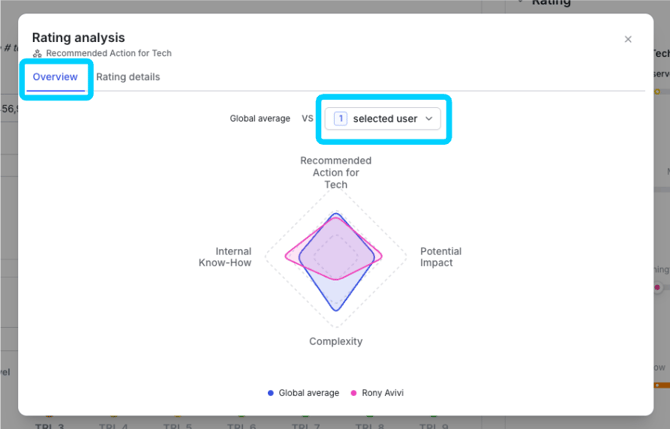
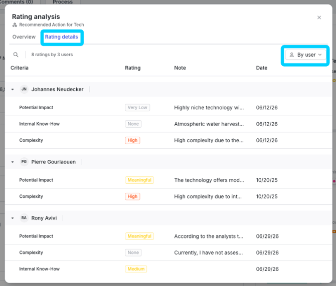
Users with the ViewRatingAnalysis permission can open the Rating analysis modal from the element card by pressing the Rating analysis icon [1]. The modal has two tabs:
- Overview - a spider chart comparing the global average against a selected user's ratings across all contributing criteria. Use the user dropdown to switch between raters.
- Rating details - a table showing each rater's rating per criteria, their note, and the date rated. Results can be filtered by user or by criteria.
Number
Numbers have all kinds of use cases, use them to enter budgets, KPIs, anything that needs a number.

Definition
The number property includes:
- Property name
- Specify range
Select the range you want to use - Unit label
Set a unit label to inform everyone what the number means. - Required
Decide whether or not this property is required for every element of this type. - Save
To save the new property
Visualization

Date
Use the date picker to set deadlines, project scopes, important events and whatever else might fancy your mind.
 Definition
The date property needs:
- Property name
- Required
Decide whether or not this property is required for every element of this type. - Save
To save the new property
Dates cannot be filtered by.
Visualization
Use a visual date picker to set the date.

Hyperlinks
Hyperlinks can be used to link all kinds of things, Signals to an idea, external websites to projects, Google Docs to projects, etc.

Definition
The hyperlink property needs:
- Property name
- Multiple values checkbox
Note: cannot be changed for the respective property at a later stage (would require the creation of a new property - Required
Information then needs to be added before the element can be created. To do so, check the "Always require a value" toggle.
Visualization
Hint: You can also use RTE properties instead of hypertext properties to better visualize links.

User
The User property can be used to assign users to virtually anything depending on the context. As a rating expert, as a process owner, add multiple users to a project, etc.
 Definition
The user property needs:
- Property name
- Multiple values checkbox
Note: cannot be changed for the respective property at a later stage (would require the creation of a new property - Required
Information then needs to be added before the element can be created. To do so, check the "Always require a value" toggle.
User properties can be filtered by in most filters.
Visualization

Attachments
You can upload most file formats, but we do have a list of formats that you cannot upload for security reasons. Please read this note to find out which file types.
You can attach files with a maximum size of 20 MB.
 Attachments can be used to store files.
Definition
The attachment property needs:
- Property name
- Required
Information needs to be added before the element can be created. To do so, check the "Always require a value" toggle.
Visualization

Relations
Relations connect elements to each other. Ideas to a Campaign, Initiatives to an OKR, Projects to a Team. Instead of a fixed set of relation types, you configure your own: name it after the connection it actually represents, choose which element types it links, and decide whether it flows one way or both.
Definition
The Relation property includes:
- Property name The name becomes the relation type — e.g., "Belongs to Campaign," "Depends on," "Supports OKR," "Owner Team."
- Related to Choose which element types can be related in this field:
- Any element type in your workspace — open the field to every element type.
- Specific element types — pick one or more (e.g., only "Campaign"). Note: You cannot remove an element type from this list while existing relations still use it. Remove or change those relations first, or the save will be rejected.
- Limit
- No limit — the field can hold multiple related elements.
- 1 Element — the field holds exactly one. Adding a new relation automatically replaces the existing one.
- Relation type Defines how the connection behaves on the related element:
- One-way — the relation only exists on this side. The related element has no reverse link.
- Two-way (same field) — the relation auto-mirrors on the other side using the same property name. Use when both sides describe the same kind of link (e.g., "Relates to").
- Two-way (separated field) — the relation auto-mirrors on the other side using a different property name you choose. Use when each side of the link has its own meaning (e.g., "Belongs to Campaign" on the Idea, "Ideas" on the Campaign).
- Related property name (only for Two-way separated field) The name of the auto-created property on the related element type.
- Save the new property.
Use cases
- Parent-Child containers — model a Campaign that holds many Ideas, an OKR that holds many Initiatives, a Program that holds many Projects. Configure a Two-way (separated field) relation with Limit 1 on the child side and No limit on the parent side.