Note: This feature will not be automatically available to all subscribers and may be part of a separate ITONICS subscription plan. If you would like to try tables, please contact us via account_manager@itonics-innovation.com.
- Configure and Work with tables
- Create Reports and Dashboards
- Sync Data and Embed Custom Reports from Business Intelligence Tools
Configure and Work with Tables
After logging in head to a Table view. As with the other ITONICS Innovation OS views and tools, you can easily filter tables and create the view you want to see [1]. At best, start by selecting the element types that should be displayed on the table (and filter if needed).

Next, you can define what properties should be displayed within the table.
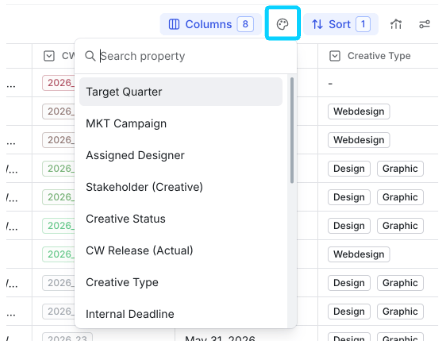
To do so, navigate to “Columns”. A popup will open from which you can select the properties that should be shown on the table as columns [2]. At the bottom of the table, an aggregation layer provides a number or visual representation of the data per column of the table [3]. You can choose between different aggregation options when you click into the aggregation field (read more on what is possible for different types of values). If you want to save a table view and share it with other users, you will find the “Save as new view” button (or “Save changes” if you want to update an existing view) at the top right above the table [4]. A popup opens asking you to provide a name for the table and giving you the option to share it universally within your workspace. Once saved, the saved table will be added to the main navigation.
Editing a table
To change the name, duplicate, export or deleted a table, click on the dots next to the Table name. A menu will open with the respective actions. [5]
To configure the table, click on View Settings [6]. A drawer will open, displaying the current configuration. From this menu, you can directly adjust the table by selecting the visible columns, defining the sorting order, and enabling or disabling the Widget.

Please note that the order by which you tick the checkboxes dictates the column structure.
Column Menu Actions
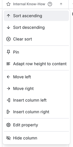
To access column actions, click anywhere on a column header. A dropdown menu opens with the following options:
- Sort ascending
- Sort descending
- Clear sort - appear only if you applied a sort.
- Pin - pin the column to the left so it stays visible when scrolling.
- Adapt row height to content - expand row height for this column to show full cell content.
- Move left - move the column one position to the left.
- Insert column left - insert an additional column to the left of this column.
- Insert column right - insert an additional column to the right of this column.
- Edit property - edit the property configuration (learn more in Edit Property Configuration in Table section)
- Hide column - hide the column from the current view.
Multi-Sort
Multi-sort allows you to sort a table by several columns at the same time. This helps you create a more precise order when one sorting criterion is not enough.
For example, in project portfolio management, you can sort first by strategic priority, then by health status, and then by end date. This helps you quickly identify high-priority projects that are at risk and close to completion.
The table applies the first sorting criterion first. If several items have the same value, the next sorting criterion is used to further organize them.You can manage the priority of your sorting criteria in the sort configuration. Drag and drop the selected sorting fields into the desired order to define which criterion should be applied first, second, third, and so on.
Please note:
The default sorting is ascending by the updated date. We recommend changing it to sorting by element title to avoid elements that you have updated, jumping to the top of your table. Above, Element Type sorting is excluded for technical reasons.Edit Property Configuration in Table
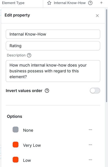
To update a property's configuration, click the column header and select Edit property from the dropdown menu. A drawer opens where you can modify the property name, description, and other settings.
Add & Create Fields in Table
You can insert an existing property as a column or create a new one directly from the column menu actions - without leaving the table.
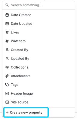
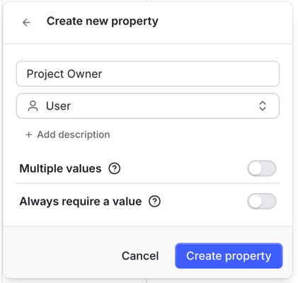
Click the column header and select Insert column left or Insert column right. A picker opens showing all available properties. To add an existing property, select it from the list. To create a new one, click + Create new property at the bottom of the picker.
In the creation dialog select a type (Text, Number, Dropdown, Date, etc.), enter a Field name, and optionally add a description. Click Create property to confirm. The new property is immediately available as a column in the table.
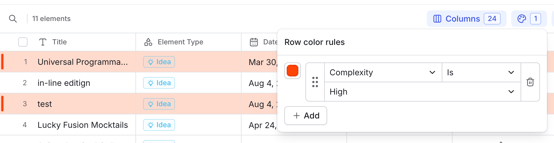
Color Rules
Color Rules let you highlight table rows based on property values, making critical items surface at a glance - particularly useful during quarterly portfolio reviews where you need to visually identify projects that need attention.
To configure Color Rules, click the palette icon in the table toolbar and choose a property. A dialog opens where you can define rules. For each rule, select a condition, and a highlight color.
Adding Data or Ratings to Tables
You can also use tables to directly manipulate any information or provide ratings for any content element on a table. To do so, double-click on a cell and change the value stored in that cell.

You can also adjust the size of each column to customize the view of your data, ensuring that you have the perfect view for your use cases. Move the column separator with your mouse and resize a column.
When you click on any title, the stack view of the content element will open on the right side. This brings you further details.
Deleting a Table
To delete a table, select the three-dot menu next to the table name in the top-left corner. Then choose Delete view from the menu to remove the table.
Configure Reports and Dashboards
On top of a table, you will also find the option to create reports (called "view widgets") and dashboards. Click on "View Widgets" and you will find all created reports and the option to add a report to the dashboard page [8]

You have the following report options - each designed to cater to different data visualization requirements:
- Donut Chart: Ideal for displaying categorical data, such as Health Status, Phase, or Responsible Business Unit.
- Average Tile: Offers a quick overview of the average value of a specific field and all elements of your table.
- Sum Tile: Visualizes the total sum of all elements of your table.
- Min Tile: Highlights the minimum value of all elements of your table.
- Max Tile: Highlights the maximum value of all elements of your table.
You will be first asked to select a report/widget type before you can say which property should be represented by the report [9 and 10]. Once configured, the report will be added to the dashboard, and you can save it alongside the table saving.
To avoid losing your configured widgets, click the "Save changes" button [4] in the top-right corner of the table.
If you want to remove a report/widget, hover over a widget, and a trash bin icon appears. Clicking on the icon removes the widget from your current dashboard.
Sync Data and Embed Custom Reports from Business Intelligence Tools
The ITONICS Innovation OS allows you to synchronize its data with any other application. Via the ITONICS API, you can extract data and, for instance, send it to a business intelligence tool, and embed a report again in your Innovation OS.
After creating a report based on the ITONICS data in any other application (read the details here), you can also embed this report back into your ITONICS Innovation OS.
To embed the report, click "Report" in the main navigation of your ITONICS Innovation OS.
If you want to embed your first report, hit “Embed Report”.
If there is already a report created, you can add another one by clicking on the name of the currently shown report. A dropdown menu opens and you will find “Embed new Report” (2).

In the embed report modal, you need to enter a title and a report URL. The URL either needs to come from Power BI, Google Data Studio, Oracle, or Tableau. If you want to embed from another Business Intelligence Platform, please contact us via support@itonics.io.
You will also find the option to "Make publicly available" (5). When you share with everyone, every workspace user with permission granted to view embedded reports finds the name of this saved view in their main menu under reports and can access it.
Per default, all user roles have permission granted to view reports.
Click on “Embed Report” to create the report.