![ITONICS-Logo-Night-Blue-2021.svg]](https://www.itonics-innovation.com/hubfs/ITONICS-Logo-Night-Blue-2021.svg)
Viewing Content
Viewing content is the lifeblood of making an informed decision on any topic, it can be accessed from all the ITONICS visualizations.
The ITONICS Innovation OS is build on a use case based navigation. Each folder can have its own use case, be it a different department, a different innovation use case, portfolio management, etc.
The key to understanding how the Innovation OS works, is to understand that:
- Elements are the basis for everything
- A view is element filter + visualization

Different visualizations
Below are the different ITONICS visualizations.
- Table
Portfolio management, strategy management - Kanban-board
Roadmapping, project management - Grid
Discovering, overviewing, managing content - Radar
Keeping up-to date with latest trends and technologies - Matrix
Analyze, track, monitor, and re-evaluate content
- Network graph
Overview relationships between elements in one place
Content is clickable, and editable in every single visualization.
Manage and restructure elements to your heart's content.
The Stack View
As you can see the content element stack view appearing on the right side is the most common and easiest way to consume content. To open it, you just need to click on the title of a content element [1].

Now, the content element information will be displayed in the right sidebar, and you can scroll through the right sidebar [2].
If you have edit rights, you can also directly apply any change, comment, relation, or rating to the content card via inline editing. Learn more about the editing options here.
You can further expand your view by two options [3]:
1. Expand/Collapse the Stack: Click the first button to the upper left on the stack card (window resize icon) to expand or collapse the Stack. This widens/shrinks the display of the content card.
2. Open the detail page in a new tab: Click the second button to the upper left (diagonal arrow icon) to open the detail page of an element in a separate browser tab.
To close the Stack, click the "X" button on the upper right part of the Stack card in front to close it. Hovering the button with more than one card on the Stack opens an additional button to Close All.
The Detail Card View
When you open a content element in full view, i.e., click the second button to the upper left (diagonal arrow icon), you will find all the content information in an extended view.
From the Explorer, you can also directly open the detail card view when you hover over a content card and find the diagonal arrow icon to the upper right of the card.

Each content card follows the same basic structure. At the top, an image to illustrate the content element can be set which will be displayed as a smaller picture and a bigger header image. To the right of the smaller image, the element type and title are displayed.
You will also find the option to watch an element below the title, i.e., receive an email notification once updates have been made or a key event has been detected. If configured by your administrator further categorizing information is displayed to the right of the header [2].
Below, a tab structure follows that determines the main body display [3]. For each content element, a larger main body (from the right to the center, [4]) and a text body to the right will be shown (where typically rating criteria and categorizations are shown, [5]).
When you choose details [3], further text information is typically displayed. The Signals Tab opens a feed that returns similar information fueled from the ITONICS Data Lake. The Comments Tab allows you to comment on the element.
Please note that you need edit rights to perform some of the mentioned activities, e.g., commenting, rating, or adding information.
Liking Content
Liking content is an easy way to vote or express a supportive opinion.
Each user can like content when they have permission to view an element type.
To like content, you will find a like button on the content cards [1] or the content overview grid in the Explorer. Within a content card, you can click on the like button to see who has liked the content [2]. If you want to remove your like, you will also find the option to remove when you click on the like button on the content card [3].
Within the Explorer, you can simply click the like button again to remove your like. Note this also means that you cannot see the individuals who liked the content from the content overview grid in the Explorer.

When you want to see an overview of multiple content and their likes, navigate to the list view. Here, you can add the number of likes as a column to the list view (from "Edit list"). Once added, you can sort the list in ascending or descending order.

An e-mail notification is sent to all watchers of the content piece once someone likes it, and you have activated to receive system emails.
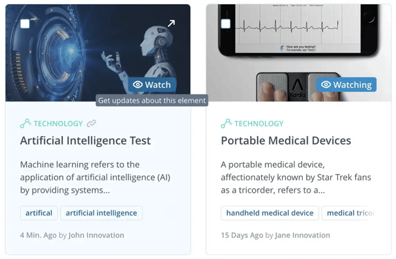
Watching Content
Watch elements allows you to get notified once an update has been made to an element you watch or a key event has been detected. To subscribe to an email and receive an email notification, you should first enable your notification preference in your personal account.
After that, you can either navigate to the Grid View, find the respective element you want to watch, and click on the watch button. You will also directly find the watch button on each content element's detail card (below the title). On the element detail page, you can also see who and how many users are watching this element.
Within the grid view, you can also filter for all the elements that you currently watch. When you open the filer section in the top right corner (see below) and check the box, the database will adjust and show only these elements.

You will also see that for watched elements, the watch button turns into watching, indicating that you are actively watching this content element.
Within the grid view, you can also select multiple elements to bulk watch or stop watching them.

Sharing Content
To inform co-workers, the Innovation OS comes with handy sharing options that allow you to send a personal email notification or share only the link with your colleagues.
Note
- only users of that workspace, are listed in the recipient list and under names
- any user — independent of their role — has the right to share
Sharing content elements
You have the option to share content elements with your co-workers and users of the Innovation OS. To share an element, find the share button on any element's view page. It is located next to the watch button and below the title [1].

When you click the button, a pop-up opens. From here, you have the option to simply copy the URL and share it with your co-workers via your preferred channel [4]. Or, you can select a user or several users whom you want to inform. In this case, enter the name or the names of your co-worker(s). Find their names in the list of users of the system and click on their names to select them [2]. Further, you have the option to share the element alongside a personal message. Once ready to share, hit the share button and send an email notification to the selected users [3].
Sharing public views
Furthermore, you can also share entire public views and not only single elements. When you want to share a radar, list, matrix, or any other view, find the share button at the top right corner of the view [5].

When you click the button, a pop-up opens. From here, you have the option to simply copy the URL and share it with your co-workers via your preferred channel [8]. Or, you can select a user or several users whom you want to inform. In this case, enter the name or the names of your co-worker(s). Find their names in the list of users of the system and click on their names to select them [6]. Further, you have the option to share the element alongside a personal message. Once ready to share, hit the share button and send an email notification to the selected users [7].
Sharing private views
In comparison to sharing publicly available views, you now have the option to also share your own private views. A private view is a saved view where you have not checked the box to make it publically available. Until shared with other users, you are the only person who can see it. The procedure to share is the same as described above for sharing public views.

Yet, when you are sharing a private view, you will see a message, informing you that the view you want to share is private [9], and the users with whom you share the view will only get viewing rights - but no editing rights.
If you want to allow editing, consider changing the list view from a private to a public view. In this case, navigate to the save button first, save your view as a new view, and make sure to check the box for "Make publicly available".
Duplicate a view
Outlined in the very first section of this article, any view is just a filter and a visualization combined.
Therefore duplicating a view, or displaying it utilizing a different visualization is easy and fast.
Exact duplicate
To create an exact copy, follow these steps (see picture for reference):
- Navigate to the navigation menu on the left side
- Open the three-dot menu at the end of the name of the view
- Press "Duplicate view"
This will create a new view called "Copy of [view-name]" and it will be set to private (indicated by the icon next to it).
By setting it to private first, instead of having two views with exactly the same content in the workspace, it is possible to adjust the view first and then set it to public, whenever its configuration aligns with the new use case, without ever showing the unfinished view to the user.
The "Duplicate view"-feature, duplicates the filter and the visualization, it does not reference the filter of the original view.
Changing the filter in either the original or the duplicate, will only change the filter in the respective view and not in both!
Duplicating or changing a view's visualization
To change the visualization of a view or to create a new view with a different visualization, follow these steps (see picture for reference):
- Navigate to the navigation menu on the left side
- Open the three-dot menu at the end of the name of the view
- Press "Duplicate as"
- Select the target visualization
If the goal is to change the visualization of the view, now, delete the original view or set it to private (be cautious, deleting the view will break any references to it, it is recommended to set it to private instead).
This will create a new view called "Copy of [view-name]", with the target visualization and it will be set to private (indicated by the icon next to it).
By setting it to private first, instead of having two views with exactly the same content in the workspace, it is possible to adjust the view first and then set it to public, whenever its configuration aligns with the new use case, without ever showing the unfinished view to the user.
Favorite views and folders
Quickly access your most important views and folders by adding them to your favorites.
Note that favorites are user specific, only you can see your own, pinned/starred, favorite views, and folders.
To pin a view or folder to Favorites, simply click the three-dot button at the end of the views/folders name and select the Add to favorites option.
