ITONICS eases the scouting and internalization of external information with two tools: Insights and Signals.
While the Signals feed is tied to a defined content element, incl. a focused description and abstract, Insights allows for a wider search by just using keywords to refine the knowledge graph.
Learn how ITONICS Prism AI can help you find strong Signals & Insights.
Both ways allow you to spot new insights when it comes to trends, technologies, or activities of organizations that can be added to your content database and provided to your co-workers for further analysis and inspiration.
- Signals feed — finding Insights and key events on saved content
- Insights feed — finding Insights on any topic
- The ITONICS Data Lake behind Signals and Insights
- Searching Signals with ITONICS Prism AI — an example
Signals feed — finding Insights and key events on saved content
The signals feed is accessible on any content element that you have already added to your database. The only requirement is that the signals page has been activated by your Workspace Administrator in the configuration settings.
Once activated and a content element is created, the signals feed is placed in a second tab next to the details tab. Once you click it [1], you will see a timeline chart, representing the amount of created patents, publications, or news (called Signals) over time. Below the timeline chart, there is a list that contains all the signals that seem to be a match based on the title, tags, and abstract provided.

Filtering of the Signals feed
Each signal in the list [2] comes with a title, an abstract, and tags (if available). Each signal is further categorized by:
- its source type, being a news, scientific publication, or patent,
- the publication date,
- the corresponding URL with a link to open the originating signal page,
- and its region.
Note that clicking on one of the tags will add it to your filter and the signals feed will be refined to results only containing the clicked tag. In this case, the system will re-navigate you to our Insight module.
When you hover over any signal entry, two more options will appear. "Block Signal Globally" allows you to exclude this signal from your list. "Pin signals to this feed" allows you to come more easily back to this signal in the list. This will also be shown to other workspace users as a pinned signal.
By default, the list is ordered by relevance, i.e., displaying the best fitting signals at first (descending order is marked bold as well as relevance). However, the list can be also sorted by the publication date and in the opposite order (use "ascending").
When you click on the title of any signal, it opens in the stack view. It contains the same information as in the list; however, it now provides the option to add the signal to your ITONICS database by hitting the button "creating element from signal" [6]. This way, you can share the specific signal with your co-workers for inspiration and further analysis.

You can also further refine the signal feed by the search bar and the filter options [3]. You can adjust the source types that should be included, i.e., patents, scientific publications, or news, and the timeframe that is taken into consideration.
Timeline graph, key events, and top events
Furthermore, when you go into the timeline graph, you can simply select a timeframe with your mouse. Hold your left mouse and drag over the timeline that interests you the most [7]. The timeline graph visualizes the interest in an element over time. The interest in an element is a normalized value relative to the element that allows the comparison of corresponding normalized values for different datasets.
The timeline graph can also indicate key events and top events. Key events help you to easily recognize a notable development inside your content element [4]. Top events now provide a contextual meaning to these key events (see picture below).
We differentiate between two kinds of developments: growth and decline in interest.
We use the following conditions to identify a development as growth:
- The lowermost point of the spike should not exceed a period of 30 days that has transpired
- A minimum growth threshold of 50% within the growth spike period
- The growth period should have a minimum standard deviation of 3
- On the day of the spike alert, there should be a minimum of 3 signals,
- Sustained growth period of longer than a month (30 days)
- Minimum growth of 50%
- Each high point should be at least 5 days from each other
- There should be a minimum of 3 signals on the day of alert
We use the following conditions to identify development as a decline:
- The uppermost point of the spike should not exceed a period of 30 days that has transpired
- We set a minimum growth threshold of -50% within the growth spike period
- The growth period should have a minimum standard deviation of 3,
- 3 consecutive low turning points
- Sustained decline period of longer than a month (30 days)
- Minimum growth of -50%
- Each low point should be at least 5 days from each other
- There should be a minimum of 3 signals on the day of alert
Each key event now also contains top events. With the help of Gen-AI1, the signals leading to a key event are qualitatively analyzed and summarized in a top event, including a captivating title, description, tags, and reference to the signals, substantiating the top event.

If the signals feature and the key events are enabled, the system will automatically create the top events. When you click on a key event [1], the respective top events driving the key event are displayed colorfully. You can now click on any key event to learn more [3]. The top events will open in the stack view to the right. If the top events is of interest, you can add it to your database and share it with your colleagues [4].
When you watch content elements from your InnovationOS, you will be informed via mail in a weekly digest about the newest top events around the content stored (and you watch) in your ITONICS Innovation OS.
Please note the following about this feature:
- Key events will only show when the source type “News” is selected and not if publications or patents are filtered.
- Key events are not curated in real time but are updated in regular cycles. As a result, existing elements will be processed for matching signals data during the next signals import, which may take up to a few days. However, you can expedite this process for individual elements by updating any of the element properties.
Data Privacy Assurance: AI-generated summaries for Top Events exclusively utilizes publicly available data from the ITONICS Signals Pool, which includes news articles, scientific publications, and patents. At no point is client-specific data accessed or used in this process, ensuring complete segregation and maintaining data confidentiality.1
Please note that this requires a specific license. To learn more about it, contact us at account_manager@itonics-innovation.com
Saving searches of a Signal feed
When you refine the signal feed by applying filters, you can save your search settings for the next time [5]. Above and to the right of the timeline graph, a save button will appear in blue if the search settings differ from the default. When you click the save button, a pop-up opens where you are asked to provide a name for your saved search.

When you have saved the search, the name of the saved search settings will be displayed to the right [8] and above the timeline chart. From here, you can select any of your saved searches at any given time. You will also find the options to update the name of any saved search or delete any completely.
Please note: Once you have saved your search, the save button will move into an update button. When using the update button with a different search setting, your saved search will be updated and the new settings included in the save.
To save a completely new search setting, please find the option to "create new filter" at the bottom of the list of the saved signal searches.
Signals feed — tips for getting good results
As the results of the Signal feed depend on the text put in each element's textual information, there are some tips to maximize the quality of the feed:
|
✅ Do’s:
|
⛔️ Don’ts:
|
Insights feed — finding Insights on any topic
Prism is excellent at finding strong Insights, read more here.
You will find Insights in the left navigation menu. When you click on it, the following interface opens. It consists of the search bar at the top, where you can use the basic search and type in any word of interest or the power search to use more specific search requests and boolean operators. Below the search bar, the result list of returning signals to your search query is displayed [2]. To the right, you find further options to refine the result list by using pre-configured filter options [3]. Besides the Filter option, you will also find the Visualize tab on the right side of Insight. The Visualize tab contains a timeline graph, a world map, and a topic cluster representation.

Please note that this requires a specific license. To learn more about it, contact us at account_manager@itonics-innovation.com
Searching and saving searches in Insight
When you enter the Insights module from the left sidebar, you will find a search bar on top of it [1]. Via the search bar, you can narrow down the result list [2]. By default and if no filtering is applied or a search term is entered, the result list shows all the signals included in our data lake (> 45 million signals as of January 2024).
You can now specify the list when you enter a search term. For using the search, you have three different options:
1. You can simply enter any search term. To add your search term, hit enter once. To start adjusting the result list, hit enter a second time.
2. You can search for an element from your database and add it to the search bar. This way, not only the term itself is considered, but also the abstract, description text, and tags you have used on this element. Simply start typing and fitting elements from the database are suggested. When you click on an element, it will be added to the search. Hit enter to adjust the result list.
3. You can operate a power search and include boolean operators
Please note: For option 2 (adding a single element from your database without any further filters), the result list will produce the same results as the Signals Feed on the element itself.
In any of the three options, each result in the list comes with a title, summary, tags (if available), the originating URL, the country, and the type (news, scientific publication, or patent). When you click on any tag, the result list will be filtered according to this tag, showing only signals that contain the tag chosen.
When hovering over any signal card, you will also find an icon to block a signal globally. When you block a signal, it will be excluded from the result list. To see the blocked signals, change the sorting of the result list from "Relevant" to "Blocked" in the top right corner above the result list.
When you click on the title of any signal, it opens in the stack view on the right-hand side (see above [6]). It contains the same information as in the list; however, it now provides the option to add the signal to your ITONICS database by hitting the button "creating element from signal". This way, you can share the specific signal with your co-workers for inspiration and further analysis. When adding the signal to your database, you will be asked to indicate to what element type the signal should be converted.
Using the power search
The Power Search allows you to specify for what (i.e., the value) you are searching where (i.e., the property) and how it should be included in the search (i.e., the operator, cf. [6] in the picture below). To activate the power search, click the icon right to the search bar [5]. Once clicked, the search bar translates into the power search function and expects the mentioned input factors (property, operator, and value).

To get a property you can double-click in the search bar, and will receive a list of all possible properties, e.g., type (= the content type, e.g., type = "patent"), label (=title), summary, source, organization (= the organization name, e.g., organization = "Apple"), and more.
Once you have entered the property and hit the space bar, new suggestions for the operators are provided. Operators can be, for instance, "CONTAINS, >, <, IN, =". Last but not least, enter the value after the operator in an asterisk, e.g., "patent", "Apple". Conclude the power search by hitting enter, and the result list will adjust accordingly.
Each search request is validated. So, if the search results do not adjust, it is likely that the search syntax is not correct.
Please also note that any value needs to be put between "quotation marks" - exact for numerical values used in combination with the operators "<, <=, >, >=".
The results of your search can be influenced by how you type in your search query. In general, search terms are not case sensitive: "ITONICS"="Itonics"="itonics", yet the use of Boolean operators is, i.e., it needs to be "OR" instead of "or".
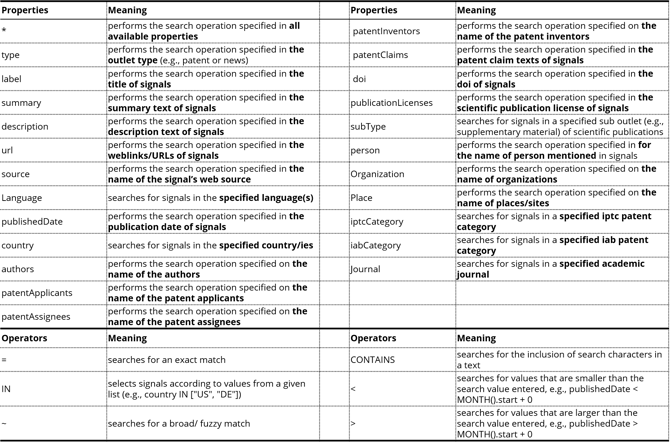
To narrow down/specify results
- Use a specific property and the operator "CONTAINS" to search for a specific term that needs to be included in the property, e.g., summary CONTAINS "Wireless Charging" results in a list of signals where the term "wireless charging" is included in the abstract.
- Use the Boolean Operator AND, e.g., when you enter (label CONTAINS "eco" AND label CONTAINS "green"), the result list only returns items that contain both words in the title
- Exclude terms by using the Boolean Operator NOT, e.g., NOT (label CONTAINS "wireless" OR label CONTAINS "energy") will create a result list with titles that either do not contain "wireless" or "energy"
To widen search results
- Use the Boolean Operator OR, e.g., when you enter (label CONTAINS "eco" OR label CONTAINS "green"), the result list returns items that contain either of the words in the title
- Instead of OR and for the IN operator, you can also use comma-separated values, e.g., when you enter (country IN ["US", "DE"] AND (label CONTAINS "eco" OR label CONTAINS "green")), the result list returns items that contain either of the words in the title and are from the US or Germany.
- Use the asterisk-type "*" to search independently of the property, e.g., * CONTAINS "Wireless Charging" results in a list of signals where the term "wireless charging" is included somewhere in the textual information.
- Use the tilde-operator (~) to perform a fuzzy string match which will usually produce a larger set of results. A fuzzy search query searches for character sequences that are not exact matches but only contained as a character sequence, e.g., label ~ "Wire" will provide results where the title does not contain exactly the word "Wire" (in contrast to label = "Wire") but this is a sequence and it will also search for titles with the words, e.g., wireless, wireframe, and alike.
Please note that you need for every compound operation (AND, OR), () brackets to perform the search, e.g., for one operator (label CONTAINS "eco" OR label CONTAINS "green") or for two operators (country IN ["US", "DE"] AND (label CONTAINS "eco" OR label CONTAINS "green")).
To help you with writing the right search syntax, we have compiled a downloadable xlsm (Excel file with macros).

Download the xlsm-Insights-Sheet Cheat
Reset your search:
If you wish to reset your search, you can use "Reset Filters" located at the top right of the filter tab, next to the gear icon. This action is available only when a filter is active. You can also clear your power search by hitting the "X" at the end of the search bar.
Performing a reset action does not remove a saved search.
Saving a search:
When you have created a custom search request that you want to come back more frequently and easily, you can save such requests. To save any search, find the bookmark icon to the right of the search bar [7]. When you click it, you will find a list of all saved searches and you can add your custom saved search. Click the plus icon at the end of the list [8]. A pop-up will open where you are asked to provide a title. You can further enrich it with a description, and you can also attach the search to any of the elements in your database. When you click save [9], it will be added to your bookmarks, and you will find it later in the list of saved searches [10].

Please note that all the saved searches are available for all the workspace users. Edit rights are granted not only to the creator but also to any user with the roles Workspace Admins or Moderator.
Filtering the Insights feed
Besides trimming the Insights feed by applying a certain search logic, the system comes with predefined filter options, summarized in the Filter tab to the right of the result list [1].

Per default, all the options in the filter section are checked, resulting in the display of the complete data lake in the result list - if no filter setting is modified, or a search is applied.
To apply a filter, navigate to any of the characteristics, e.g., countries [2], and click on the values that you want to be included. You can simply check/uncheck the necessary boxes or select a time range [2].
When you want to clean your filtering, use the reset button at the top right corner of the filter tab [3]. Next to it, you will also find the configuration page of the filter settings [4]. From the configuration page, you can re-order the display of available filters. Plus, you can check/uncheck the criteria that should be available for filtering.
Please note:
- The following filters are visible by default: Published Date, Signal Types, Countries, Tags (Topics), Categories
- In bar chart filters, only the top options are shown by default. To see how many more values are part, look at the bottom of the widget. when you click on the name of the filter category, a dropdown will open from which you can choose any available option.
- It can happen that signals do not have any value for a property (e.g. if the country of publication is unknown). This category is shown in the dropdown and also in the bar chart "(No Value)".
- You can filter on the same property at the same time using the filter tab options and the power search. As the different parts of the query each narrow the search field down, only the intersection between the two filters will make it to the result list. For instance, choosing Germany in the country dropdown while running the power search country = "US" will produce no results, as a signal can only have one originating country and not both in the US and GER.
💡 Tips:
- To select a single value for the filter, hover over an option. Click on the ONLY button that appears to select only that option. Click outside the dropdown to submit the changes.
- Hovering over a bar chart entry with your mouse will reveal how many documents belong to this value. The same information is also visible in the dropdown. You can deselect a value straight from the bar chart, by hovering over an entry and clicking on the "x" that appears.
Timeline, world map, and topic clusters
Next to the Filter tab, there is a second tab called Visualize [1 in the picture below]. The Visualize tab comes with three visualizations that help you to better understand the developments and insights within your searched topic and provides even more filter options:
- The Timeline visualization assists you in understanding how a topic has developed over time. Are more or less insights published in a certain timeframe? It helps answer the question: If you invested in this technology, or tried to satisfy this market trend, would you be one of the first movers or a laggard?
- The World Map visualization allows you to easily view where the topic is being talked about. It answers the questions: Where are the most insights generated?
- The Cluster visualization enables you to understand which areas are particularly important within a topic or trend. It answers the questions: Which industry, discussion point, or policies have strong ties to this topic or trend?
Timeline
The timeline visualizes the number of signals published over time which is indicated by the y-axis [2]. Each data point is aggregated over time and if you have selected all three source types (news, scientific publications, and patents), each of them is displayed as a single line.

You can also adjust the timeframe that you want to look into. To do so, you can click the three dots at the top right corner and indicate your date range [3]. Or, you simply drag and drop your mouse cursor across that part of the visualization to select the timeframe [5]. The visualization and the signal result list will be filtered down accordingly.
By ticking the "Compare Growth" checkbox in the extended options [4], you can normalize each series by its maximum value during the period defined in the search field. Normalizing solves the issue that the absolute numbers across the groups can differ substantially by adjusting the scale and making it easier to compare the series.
World map
The world map visually represents where the amount of signals is originating. It takes the country information from each signal and aggregates the information. It comes below the timeline chart [6] when you scroll down.

Each bubble represents the number of signals per country. The pie charts represent the split of signals by the document types. When you click on a country in the world map [7], the result list will apply the country as a filter, and the result list adjusts accordingly. Clicking on the country again will remove the selection.
Besides the pie charts, you have also the option to enable shading and bubbles [8]. Both options will add additional visual indicators to separate the number of signals between the different regions, e.g., the bigger the bubble/the darker the region, the more signals are coming from this region. By clicking on the labels, you can activate/deactivate the visual indicators [8].
⚠️ Note that the bubbles are sized according to a logarithmic scale.
You can zoom in/out of the world map by using the control panel at the top right corner of the world map. When you want to reset your complete filter, click the return button above the world map and to the right of it.
Cluster visualization
The cluster visualization allows you to discover the content categories of your search/filtering. We currently use the category property to cluster the documents. These are based on the IPTC Media Topics standard. The cluster visualization is made up of bubbles representing topical clusters. As a general rule, the bigger the cluster is, the more signals are within. The number of signals within a bubble is indicated on the bubble.

When clicking on a bubble you will zoom into the bubble, enabling you to see more detail about the bubble's descendants, like information about the documents within. The label of the current bubble is displayed at the top of the visualization with a "←"-button next to it that allows you to zoom out again.
When you dive into any category, the result list will adjust accordingly, thus it acts like a filter. On any level, you can remove categories from the filter by hovering over the cluster and hitting "X" (see the screenshot example at the top). This will remove the category itself and all its descendants.
Please note ⚠️
- A single signal can belong to many categories. This is why adding up the counts of signals on all bubbles will likely produce a higher number than the total number of Signals.
- The categorization we are currently using is hierarchical. This means that there are only a few high-level categories that have sub-categories which in turn, can have further sub-categories.
- Some signals belong only to a parent category and do not belong to any category lower in the hierarchy.
The ITONICS Data Lake behind Signals and Insights
In the Signals feed and Insights, we display patents, publications, and news from a multitude of sources.
| News | Scientific Publications | Patents |
| updated several times daily | updated daily | updated weekly |
|
|
|
💡 If you have suggestions for sources (especially news sites), contact our support at support@itonics.io.
Utilizing AI — ITONICS Prism
The ITONICS AI, Prism, is perfect for finding strong signals. Especially with a nicely set up Master Context.
Best practices for using Prism with the Signals pool
- Setup a Master Context
With a good Master Context, Prism will only include Signals that fit your company, this is very important to get good results. - Specify to search the Signals pool
This will prompt Prism to surrogate the task to the dedicated Signals Agent, without that, PRISM might understand what to do, but maybe the AI just hallucinates some Insights which we don't want. - [Optional] Specify a filter
With a specified filter, Prism will limit the search. - Specify what Prism should do after
It is always a good idea to tell Prism to create new "Idea" elements for each fitting Insight and to link the Signals inside the elements (in the "sources & links" property or any link-property)
Example prompt
Setup the Master Context as specified here. After that, Prism automatically considers it for every prompt, unless specified otherwise.
Search the signals pool, consider all signals in the past year in the EMEA area and create new idea elements for good ideas you found and make sure to link the Signals to the elements.
Prism's answer
In this example, the Master Context was setup to reflect the needs of an automotive software company


Try out Prism now and read more about ITONICS Prism.