![ITONICS-Logo-Night-Blue-2021.svg]](https://www.itonics-innovation.com/hubfs/ITONICS-Logo-Night-Blue-2021.svg)
Note that the Element Configuration feature is part of our Professional offering. It is not available out of the box and needs to be enabled for your organization. Contact us at support@itonics.io to enable it for you!
- What does the Element Configuration do?
- What are the ITONICS blueprint element types?
- How can I configure my custom element types and properties?
- What limitations do we need to consider?
- 💡 General Tips for Element Configuration
What does the Element Configuration do?
Your Innovation OS is designed for End2End-Innovation Management. This comes along with content being entered from different contexts. To allow structured processing, this content needs to be classified. Element Types are in this respect the first classification principle in your Innovation OS.
Content that falls into a certain element type will have the same characteristics and distinct properties. You can think of an element type as a template. The element types and their related properties thus allow comparing the content of the same type, filtering for it, displaying it in the tools, and enabling/disabling it for your different workspaces.
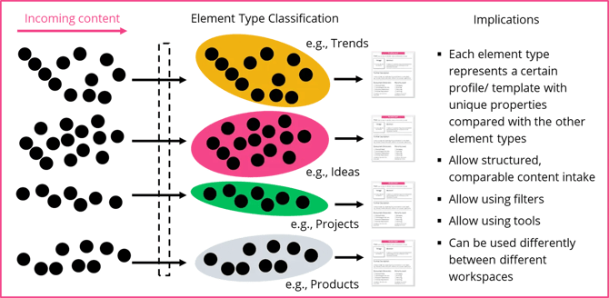
ITONICS offers the full flexibility to design your custom element types or use the ITONICS blueprint element types. You can thus reflect your organization's vocabulary in your Innovation OS. The definition of element types and properties is done via the Element Configuration (EC).
What are the ITONICS blueprint element types?
To start as soon as possible, ITONICS has compiled its experience into recommended element type blueprints. With these pre-configured templates, you can fully concentrate on the content work and do not need to worry about creating custom elements.
ITONICS offers element type blueprints for the following content types:
| Element Type | Trend | Technology | Scenario |
| Specific properties* |
|
|
|
| Element Type | Risk | Opportunity | Inspiration |
| Specific properties* |
|
|
|
| Element Type | Innovation Project | Idea | Campaigns |
| Specific properties* |
|
|
|
* All blueprint element types come with the following similar properties: name, color, icon, description, tags, sources & links, relation widget, and attachments.
If you want to you can also modify the blueprints.
Please note:
- these blueprints are pre-configured templates, not pre-activated content. Each one is activated per workspace by a workspace administrator via "+ Add new element type" → "Activate ITONICS blueprints" (or by importing a template from another workspace). Until activated, a blueprint's element type does not appear in the workspace.
Configuring custom element types
 The Element types page
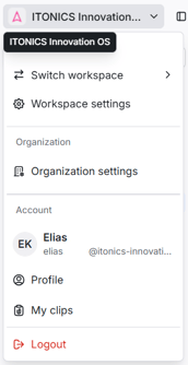
To add your custom element types, modify ITONICS blueprints, or change any element type, you will first need to open the settings of the respective workspace. As a workspace administrator, open the workspace settings from the left side nav — they open in a window over your Innovation OS — and go to Element types in the sidebar.
The Element types page lists every element type in the workspace, together with the number of elements and the number of properties each one uses [1]. Use the search field to find a specific element type, or click an element type’s name to open its configuration. There you define the name and structure of your element types, and add the properties — each consisting of a name, a property type, conditions, and values. Your element detail page will consist of the properties you put into the element type.
To start creating your custom element types, click the Add element type button [2]. Or, if you want to modify an existing element type, click its name in the list to open its configuration [3].
When you add a new element type [2], a dialog asks how you would like to start [4]. Choose Use a template to pick from our library of best practice examples, or Start from scratch [5] to create your very own element type, and then click Next.
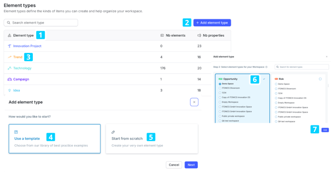
When you select Use a template, a modal will open, showing you the available element types from all the workspaces. Find an element type that you want to activate and activate it by clicking the name of the workspace from which you want to import the configuration [6]. In the next step, the system checks the compatibility and, if all goes right, the element type will be added to the workspace [7].
Note: If imported element types use properties that already exist in your workspace, your workspace version of those properties is kept. Imported content will adapt to your existing configuration.
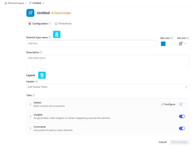
When you select Start from scratch, a blank configuration opens where you can first name your element type, set a color and an icon, and add a description to make it easier for others to understand the meaning of the element type [8]. Under Layout, you can then choose which fields appear in the element’s Header, and which Tabs are available on the element: Details (the main content and properties), Insights (AI-generated, cited insights on what’s happening around this element), and Comments (a discussion thread on each element). Use the toggles to switch Insights and Comments on or off, and drag the handles to change the order in which the tabs appear [9].
As a next step, you can add further properties and arrange the position of such properties on your element type. To do so, click Configure on the Details tab. This opens the element details page layout where you can start structuring the page. Click Add block to define what kind of layout type you want to add.
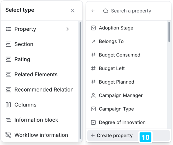
There are several types from which you can choose:
- Property: Attachments, Dropdowns, Hyperlinks, Date, Number, Rich Text, Step, Formula, Smart Excel, Rollup, and User Fields.
- Section: Group above mentioned Properties in a Section
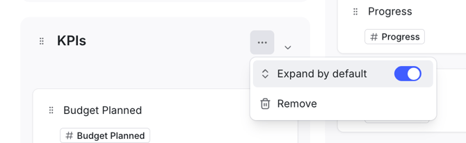
- Decide if the section is expanded or collapsed on the detail page by default
- Rating: Group Rating properties (Numerical Rating, Rating, Aggregated rating) in a Rating Section
- Related Elements: Add a widget to display all related elements
- Recommended Relation: Add a widget to suggest relations (shown for published elements only)
- Columns: Add two new blocks to use any of the above mentioned types
- Information block: Use this RTE-style block anywhere on the detail page to provide additional context and explanatory information
- Workflow actions: Add a widget to place the action buttons of the workflows active on an element anywhere on the detail page, rather than at their default position in the top right
If you have selected a Section or a Rating, you need to provide a name for your section header. To add properties now to the Section click on "Add block" and you will find a menu from which you can select from all available properties. Just search for a property or use the scrollbar to find the respective property. Add a property to your section by clicking on the property.
To create a new custom property, you have an option at the bottom of the property selector. [10] Choose the property type and add the required information like Name, Requiredness, Options, etc.
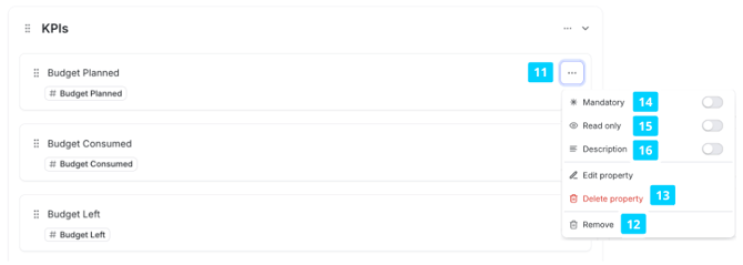
To edit a property you need to navigate to the three dots and click on "Edit property". [11]
Once you have collected all the properties per section, you can use drag and drop to change the order within the group field or to change the overall position of a group field compared to other group fields you have created.
If you later realize that a certain property should not be displayed any longer, you have the option to remove the property from the element type [12]. Removing a property only affects the current element type. The property itself remains available in the workspace. Removing does not delete any data: the property and everything already captured in it, is kept in the background. If you add the property back to the element type, that data reappears. Because nothing is deleted, no warning is shown when you remove a property.
In the property selector, the Used by section lists the properties that were previously removed from this element type but are still connected to it in the background. Adding such a property back from here restores it together with the data it previously held.
In addition, you have the option to permanently delete a property directly from the Element Configuration form [13].
Unlike removing a property from a specific form, deleting a property allows you to:
-
Delete the property entirely from the workspace (it will be removed from all element types and other forms), or
-
Delete it selectively from specific locations
Please note that when a property is permanently deleted, all stored data within that property will also be permanently deleted. This action cannot be undone.
⚠️ Because deleting a property may result in data loss, the system includes built-in safeguards and confirmation steps. Before confirming the deletion, you will receive full transparency about where the property is currently used. Some properties cannot be edited or deleted because they are managed by the system rather than configured by an admin. These protections are set automatically and cannot be changed. They apply to:
- System-required fields, such as Title and Summary.
- Calculated fields, such as Budget Left and Resources Left.
- Auto-fill fields.
- Inverse relation fields, which are managed through their parent relation.
When editing or deletion is blocked for one of these reasons, the system indicates it directly.
Note: The deletion procedure follows the same logic across all configuration areas of the system, including Sites and Process Builder forms.
Properties also support additional configuration options:
-
Mandatory: Declare the field value as mandatory for the element detail page [14]
-
Read-only: Display the field value without allowing edits. The field remains visible but is not interactive. [15]
-
Description: Add contextual help text below the field label to guide users. This supports plain text and is hidden if empty. [16]
Note: Read-only cannot be combined with a field that always requires a value - if the field is required, read-only is disabled to ensure input is possible.
Once you have placed all properties, you are satisfied with the positioning, and the general settings, click the "save changes" button.
While you are editing an element type, an Unsaved changes badge appears next to its name until you save.
To remove an element type altogether, open it and use Delete element type in the Danger zone at the bottom of the page — once deleted, an element type cannot be recovered.
As a last step, you can now go through your different workspaces and activate/de-activate your custom element type or you can selectively decide to add/remove the properties. For more information, see the following article: Slicing content for different groups: The Workspace Configuration
What limitations do we need to consider?
Please pay attention to the following notes
- You can enable "Always require a value" on an existing property at any time. When you enable it, you must set a default value, which is applied to all existing elements that have no value for the field. Turning the toggle off again clears that default value. This option is available for Text, Date, Hyperlink, Dropdown, Hierarchical Dropdown, Number, User, and Relation properties; it is not available for Rich Text, Attachments, Rating, Numerical Rating, and Aggregated Rating.
- Minimum and maximum values for number and numerical rating properties cannot be made more restrictive. They can be made less restrictive, however.
- Element types can only be deleted if there are no content elements of that type anywhere in the system.
💡 General Tips for Element Configuration
Don't make it too complicated: Try to reduce the total number of properties you add to an Element Type as much as possible. This makes it easier for users to consume the content. Especially when it comes to textual Properties, consider only using a single rich-text property that
Keep rating criteria few & consistent: Don't add too many rating criteria to make it easier and more engaging for collaborators in the tool. Also, it helps to keep the criteria consistent with regard to the number and values of the different options.
Don't enable multiple values for Radar segmentations: If you want to create a property that can be used as a segmentation for the Radar visualization, types Dropdown and Hierarchical Dropdown are likely candidates. Just make sure not to enable the option "Allow Multiple Values", as the Radar can only use Properties that have single values assigned.
Go for a common base and add specifics on top: If you have multiple Workspaces that need slightly different-looking Elements of a type, start off with defining the Element Type using the common Properties needed everywhere for the entire Organization, and then go into the Workspaces' settings and add Properties to the Element Type that are specific only to the respective Workspaces.
Re-use Properties for multiple Element Types: Try not to create multiple Properties that are very similar for different Element Types. Rather think of a way to combine those Properties into one - this will keep your system clean, and allow you to create visualizations with Elements of multiple Element Types, using those Properties.
Use the ITONICS blueprints as much as possible: ITONICS offers you free content through the ITONICS Showroom (Trends, Technologies, Risks, and Inspirations). If you are interested in that content, avoid creating custom types, but instead customize the ITONICS blueprints for your Workspaces. This way, you will be able to use the ITONICS content next to your own, displaying them together in visualizations!
- Element Type: Elements are the basic building blocks of the content in ITONICS. And Elements can be of different types - they can be Trends, Technologies, Projects, or Companies, for example. Depending on an Element's type, different information is relevant and will be shown.
- Property: A Property is a piece of information that belongs to an Element. For example its title or summary, but also rating criteria or dropdowns that describe the Element.
- Property Type: Each Property has a certain type which - analogous to an Element's type - will decide how that Property is shown and what kind of information it contains. Examples are rich text fields, dropdowns, or rating criteria.
- Section: Element configuration enables you to group Properties into logical units that will be shown together. There are different kinds of groups that change how the group will be displayed and that might impact what type of Properties can be placed within.
- Blueprint Element Types: ITONICS comes with a set of predefined Element Types such as Trends, Technologies, or Inspirations. We also provide content of those types in the ITONICS Showroom.