


Most product launches don’t fail because teams lack talent. They fail because no one knows who owns what, by when.
A product Gantt chart is meant to solve this. It turns a complex development plan into a shared visual timeline every team member can act on. By providing a clear visual representation of the project timeline and responsibilities, a product Gantt chart helps keep everyone on the same page and aligned throughout the project.
But most teams build it once at kickoff, feel organized for a week, and then watch it drift out of sync with reality. Gantt charts are widely used in industries such as marketing, construction, IT, and event planning to visualize project tasks and timelines.
In reality, the problem is not the tool but how teams use it. Gantt charts improve communication by allowing stakeholders to quickly understand project status without needing to review detailed reports. Most teams treat a Gantt chart as a planning artifact. The teams that actually benefit treat it as a management discipline with four ongoing stages.
This guide covers that discipline in full.
What is a product Gantt chart?
A product Gantt chart is a visual project management tool that maps out product development tasks, timelines, dependencies, and owners against a chronological schedule (Exhibit 1).
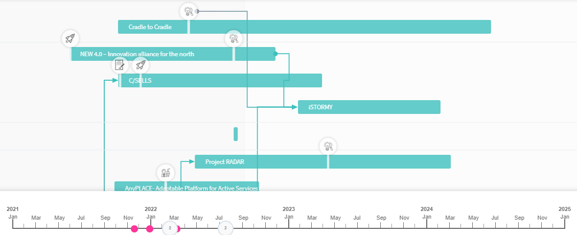
Exhibit 1: A Gantt chart as a visual project management tool
It provides a comprehensive overview of the entire project, allowing teams to manage schedules, dependencies, and milestones effectively. Each row represents a project task or phase, and each bar shows its start and end dates.
Henry Gantt developed this format in the early 1900s to schedule factory production. Today, product teams use Gantt charts to plan and track development cycles from discovery to launch. The vertical axis in a Gantt chart lists specific tasks and subtasks required to complete the project.
The Gantt chart format does two things better than most other project management tools.
- It shows task sequences and dependent tasks in a single view.
- It makes the project timeline visible to everyone simultaneously, including stakeholders who don’t attend daily standups.
The bar chart structure is deceptively simple. The real value is in the dependency links between tasks. When you link task dependencies visually, delays propagate automatically through the chart. You see the downstream impact of any slip before it becomes a crisis.
Why project managers rely on Gantt charts
Clearly defining the project scope is essential before building a Gantt chart, as it guides the scheduling and resource allocation process. Usually Gantt charts answer the three questions that kill velocity:
What is due? Who owns it? What is blocked?Without a visual project timeline, teams track tasks across spreadsheets, emails, and verbal updates. Thus, a shared visual timeline is one of the most direct ways to close that gap. Gantt charts help with better time management by providing clear timelines that help teams stay focused on priorities:
- Gantt charts also make trade-off conversations concrete. When a stakeholder requests a scope addition, a Gantt chart view shows exactly which tasks shift and by how much. Abstract debates about delivery dates become fact-based discussions.
- Further, Gantt charts help track progress and monitor progress throughout the project lifecycle.
- Gantt charts are ideal for large, timeline-driven projects that involve multiple phases and dependencies, and are commonly used in industries such as construction, manufacturing, IT, and professional services to manage projects and allocate resources effectively.
Using Gantt charts to manage projects contributes to project success by improving planning, resource allocation, and task prioritization.
The 4-stage product Gantt chart framework
Most teams only apply stage one. The teams that stay on top of every development stage apply all four - in sequence, on a recurring basis. This 4-stage framework aligns with the project life cycle and helps manage project phases from start to finish, ensuring that the product Gantt chart supports the entire project lifecycle (Exhibit 2).
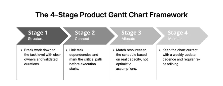
Exhibit 2: The 4-stage product Gantt chart framework
It is recommended to group tasks by phases to create a hierarchical structure that is easier for stakeholders to digest. Additionally, breaking the product development lifecycle into manageable tasks using a Work Breakdown Structure (WBS) improves project control and clarity.
Each stage builds on the previous one. Skipping stage two makes stage three impossible. Skipping stage three makes stage four meaningless.
Here is what each stage requires in practice.
Stage 1: Structure your work before building the chart
The most common Gantt chart failure starts before the chart is built. Teams often fail to break down work into detailed tasks and manageable tasks, leading to confusion and a lack of accountability. Listing project tasks at the wrong level of detail, assigning them to groups instead of individuals, and estimating durations without checking capacity are frequent pitfalls.
To structure work correctly for a product Gantt chart:
- Start with deliverables, not tasks. List every output the project must produce. Deliverables are tangible: a design spec, a tested feature, a signed-off requirement document. Work backward from each deliverable to define the tasks required to produce it. Incorporate a clear task list in your Gantt chart to ensure accountability and efficiency among team members.
- Break each deliverable into work packages of one to five days. Anything larger than five days is still a phase, not a task. Large tasks hide complexity and make progress impossible to track meaningfully. Defining the correct task sequence is crucial to ensuring dependencies are clear and the project flows smoothly.
- Assign each task to one person. Not a team. One person. Shared ownership creates no accountability. If two people own a task, neither of them fully owns it.
- Validate durations with the assigned owner. Bottom-up estimates from the people doing the work are 30 to 40% more accurate than top-down estimates set by project managers. Build the project schedule from contributors’ input, not over it.
- Use a Gantt chart template as a starting point. Most Gantt chart software includes built-in templates organized by project type. Many Gantt chart tools provide Gantt chart templates to help users quickly set up their project timelines and task lists. A five-phase Gantt chart template covers most product development processes: discovery, design, development, testing, and launch. Treat it as a skeleton, not a prescription.
The output of stage one is a task list with owners, durations, and start and end dates. That is the raw material. The chart comes next.
Stage 2: Connect dependencies and identify the critical path
A list of tasks with dates is a project schedule. A Gantt chart becomes useful when you link task dependencies - making the sequence of work visible, not just the timing.
Dependency linking changes the chart from a calendar to a logic model. When task A must finish before task B can start, that relationship is explicit in the chart. When task A slips, the chart recalculates task B’s start date and every downstream task in the chain.
/Still%20images/Network%20Graph%20Mockups%202025/capabilities-collaboration-seeing-relationships.webp?width=2160&height=1350&name=capabilities-collaboration-seeing-relationships.webp)
Exhibit 2: Network graphs enable getting an overview of the relationship between elements
Network diagrams can be used alongside Gantt charts to visualize complex task dependencies and sequences, providing a clear map of task order and relationships (Exhibit 2).
- Link all dependent tasks explicitly. Do not assume the sequence is obvious from the row order. If development cannot start until design is approved, link those two tasks directly. Every dependent task pair needs a visible connection.
- Identify the critical path. The critical path is the longest unbroken chain of dependent tasks from project start to project end. Any delay on this path delays the final delivery date by the same amount. Tasks not on the critical path have float - they can slip without immediately affecting the end date. Critical path analysis is a key feature of project management tools and helps optimize project scheduling.
- Set milestones at phase transitions. Milestones are zero-duration markers that signal a significant handoff or decision point: end of discovery, design sign-off, development freeze, QA complete. They give the project a readable skeleton above the task-level detail. Milestones in a Gantt chart are key checkpoints, often representing significant achievements like 'Design Approval' or 'MVP Launch.'
- Add a schedule buffer after the critical path. After your longest critical path sequence, add a buffer equal to 10 to 15% of the total project duration. Do not hide buffer inside individual task estimates. Visible buffer is honest. The hidden buffer gets consumed invisibly and leaves no margin when real problems surface. Buffers are intentionally added before risky handoffs in a Gantt chart to absorb unexpected delays without derailing the plan.
The output of stage two is a Gantt chart with visible task sequences, a marked critical path, phase milestones, and an explicit buffer. This is the chart you validate with your team before execution starts.
Stage 3: Allocate resources against real capacity
A Gantt chart can look perfectly structured while being completely unworkable. The most common reason: tasks are assigned to people who do not have the capacity to complete them on the dates shown.
Project scheduling software and project management software help allocate resources effectively and manage project timelines, ensuring that work schedules are realistic and bottlenecks are avoided. Resource allocation is where the gap between a plan and a deliverable schedule opens up.
- Map each person’s availability before finalizing dates. Account for vacation, parallel project commitments, and recurring meeting overhead. A developer who spends four hours per day in meetings has four hours of development capacity, not eight.
- Identify overallocation before it happens. If one person is assigned to tasks covering more than 80% of their working days in a given week, that week will slip. This is not a question of effort. It is a math problem.
- Level resources by moving non-critical tasks. When you find overallocation, shift non-critical tasks - those with float - to time periods where the assigned person has capacity. This is resource leveling. It requires effort up front. That effort is always cheaper than recovering from a slipped schedule three weeks into execution.
- Track actuals once execution starts. Record how long tasks actually take compared to the original estimate. Teams that track actuals for six months reduce estimation errors by 30 to 40%. That data makes every future project plan more accurate from day one. Progress tracking is essential for monitoring the ongoing status of tasks and overall project advancement.
The output of stage three is a project schedule that reflects what the team can actually deliver, not what the project plan wishes were true.
Stage 4: Maintain the chart as a live management tool
This is the stage most teams skip entirely. It is also the stage that determines whether the Gantt chart delivers value or becomes a launch artifact. Online Gantt charts and online Gantt chart tools enhance collaboration by providing real-time visibility into project progress for all team members. However, due to the complexity of Gantt charts, some team members may require training to effectively read and update them.
A Gantt chart built on day one and never updated is worse than no chart. It creates false confidence. Teams make decisions based on assumptions that no longer reflect reality. The chart shows green when the project is red.
- Set a non-negotiable update cadence. Weekly updates work for most development phases. Daily updates are appropriate in the two weeks before a major milestone or launch. Require each team member to update their task status before the weekly team review. Without this, the review is based on memory rather than facts. Using a Gantt chart online allows for real-time updates and collaboration, making it easier for everyone to keep the chart current and monitor project progress.
- Conduct a weekly milestone review. Check every milestone in the next 30 days. For each at-risk milestone, confirm the owner has a concrete mitigation plan - not a statement of intent. A milestone with no clear path to delivery is a missed deadline waiting to be confirmed.
- Re-baseline every two weeks on long projects. For projects spanning more than three months, re-baseline the chart every two weeks to reflect actual progress against the original plan. Teams that re-baseline regularly make course corrections early. Teams that do not re-baseline discover problems at the point of delivery.
The output of stage four is a Gantt chart that earns trust. When team members know the chart reflects current reality, they use it to make decisions. When it drifts, they stop checking it and go back to informal updates. At that point, the chart has failed - regardless of how well it was built.
When the 4-stage framework reaches its limits
The framework works for most product development programs. Using the right Gantt chart tool helps move the project forward efficiently by providing clear project scope, goals, and real-time collaboration features. It breaks down into two scenarios:
- When projects become too large to read in a single chart, and
- when your team is running multiple projects with shared resources.
Templates for Gantt charts are available for different industries, including marketing, construction, and software development, making it easier to tailor your planning and execution to specific project needs.
Complex projects: add a two-level structure
When a project involves 50 or more tasks, five or more parallel workstreams, and 15 or more team members, a single Gantt chart view becomes unreadable. Scrolling through hundreds of task bars to find a critical path issue is not project management.
Consider the following example: In a construction project, breaking down the work into project phases and visualizing them with Gantt chart bars helps manage complexity and ensures clarity for all stakeholders.
Multiple projects: when you need a portfolio layer
The deeper limit is coordination across projects. Most product teams run multiple development programs simultaneously. Each has its own Gantt chart, its own resource demands, and its own strategic priority.
- A delay in one project affects resource availability in another.
- A shift in strategic priorities should change which projects accelerate.
Standard Gantt chart software cannot surface these connections because it only sees one project at a time.
This is where ITONICS adds a layer that Gantt chart tools cannot provide on their own.
ITONICS is a strategic innovation management platform that operates above the project level. It gives product and innovation teams a consolidated view of all active projects - their strategic alignment, resource demands, and interdependencies - alongside interactive Gantt charts and roadmap views in the same platform.
Where a Gantt chart answers "are we on time?", ITONICS answers "are we working on the right things?".
- Project managers monitor task-level progress.
- Leadership monitors portfolio-level alignment.
- Resource managers see workload across the entire portfolio, not just one project at a time.
The 4-stage framework runs inside a single project, whereas ITONICS runs across the portfolio. Product development teams managing more than one product at a time need both.
Gantt chart alternatives for the right situation
Gantt charts solve a specific planning problem. For other situations, other tools perform better.
Kanban boards suit early discovery phases where tasks lack fixed timelines. Use them when priorities shift daily, and durations cannot be estimated reliably (Exhibit 3).

Exhibit 3: Monitor progress, make informed prioritization, and cultivate seamless collaboration with Kanban boards
Sprint boards handle two-week agile delivery cycles better than Gantt charts. Use a Gantt chart at the release and roadmap level. Use a sprint board at the team delivery level.
Network diagrams show complex task dependencies in a non-linear structure. They suit planning scenarios where the order of operations is genuinely tangled, and a sequential bar chart would flatten important relationships.
Most product teams benefit from combining tools, not choosing one. Match the tool to the planning horizon. The Gantt chart handles the program level. The sprint board or Kanban handles the team level.
Gantt chart software: what to look for
Choose software that supports all four stages without creating friction between them. A good Gantt chart tool should offer customizable Gantt chart templates for different project types, making it easier to get started and adapt to your industry needs.
The minimum requirements for product development work:
- Interactive Gantt charts with drag-and-drop task and date editing
- Dependency linking that automatically recalculates downstream tasks when one shifts
- Critical path highlighting to identify which critical tasks block the final delivery
- Real-time collaboration so all team members see updates without refreshing
- Resource views showing workload by person across the project timeline
- Portfolio alignment to connect individual project tasks to broader strategic priorities
Many Gantt chart tools provide templates to help users quickly set up their project timelines and task lists. Project scheduling software often includes features for exporting Gantt charts to a PowerPoint presentation, making it easy to communicate project progress and details to stakeholders.
Before committing to any tool, test four things:
-
Can you set up a working chart in under one hour?
-
Can you link task dependencies by dragging between bars?
-
Can contributors update their own tasks without a paid seat?
-
Can you export a Gantt chart view for a stakeholder briefing?
A free Gantt chart maker works for small teams on single programs. Paid tools add resource allocation dashboards, workload balancing, and deeper integrations that pay for themselves in reduced coordination overhead.
Take your product Gantt chart from execution to strategy with ITONICS
The 4-stage framework makes a single product Gantt chart work. ITONICS makes it work across your entire portfolio.
Most product teams eventually hit the same ceiling. Individual projects are tracked. Individual Gantt charts are maintained. But nobody has a clear view of how those projects connect to each other, compete for the same people, or align with the strategic priorities they were meant to deliver.
ITONICS closes that gap. It is a strategic innovation management platform built for product, R&D, and innovation teams that need more than project scheduling. ITONICS combines interactive Gantt charts and visual roadmaps with portfolio-level analytics - so project managers can track task progress while leadership monitors whether the right work is being done at all.
Specifically, ITONICS enables teams to:
- Manage multiple projects in one view - see all active programs, their timelines, and their strategic alignment without switching between separate Gantt chart tools
- Allocate resources across projects - identify overallocation and workload imbalances across the entire portfolio before they become delivery problems
- Connect execution to strategy - evaluate and prioritize projects based on strategic value, not just schedule urgency
- Spot portfolio-level risks early - when one project slips, ITONICS surfaces the downstream impact on related initiatives immediately
If you are managing more than one product at a time, or if your team's delivery work is not connecting visibly to your strategic priorities, explore what ITONICS can do for your portfolio.
The Gantt chart tells you whether your team is on track. ITONICS tells you whether the track leads somewhere worth going.


.webp??&width=900&height=450&name=Top-10-project-portfolio-software-tech-and-development-teams-use-for-managing-innovation-projects-fullwidth%20(1).webp)