Most strategic plans fail not because of uninformed planning. They fail because no one can see what is actually happening.
Executives approve strategic initiatives. Teams begin executing, but then the visibility disappears. Progress updates arrive too late, in the wrong format, or not at all. By the time leaders realize a strategic goal is off track, the window to course-correct has closed.
Strategic dashboards exist to solve this problem. A well-designed dashboard gives every decision-maker a live view of strategy execution. It surfaces bottlenecks before they become failures. It connects daily tasks to strategic objectives, so teams understand why their work matters.
This article explains what a strategic portfolio dashboard is, why most organizations build them wrong, and how to create one that drives real strategic agility.
Why strategy execution breaks down without dashboards
Many organizations treat strategy as an annual event. Leaders develop strategic plans in Q4, distribute them in Q1, and then return to operational work. The strategy becomes a document instead of a living system.
The result is a predictable pattern:
-
strategic initiatives stall,
-
resource allocation decisions get made with outdated data, and
-
teams lose sight of the bigger picture.
Performance metrics exist in spreadsheets. Key performance indicators live in separate project management tools. And in the end, no one has a complete picture.
The gap between strategy and execution grows because the data is fragmented. Teams track progress in isolation. Leaders make informed decisions based on information that is weeks old. Strategic alignment breaks down not because of disagreement, but because of missing visibility.
A strategic portfolio dashboard closes this gap. It consolidates key metrics from across the organization into a single live view. It turns raw data into actionable insights that leaders and teams can act on immediately.
What a strategy portfolio dashboard actually is
A strategic portfolio dashboard shows the health of all active strategic initiatives simultaneously (Exhibit 1). It tracks progress against strategic objectives, flags resource bottlenecks, and surfaces gaps between planned and actual outcomes. It connects individual performance metrics to organizational strategic goals.
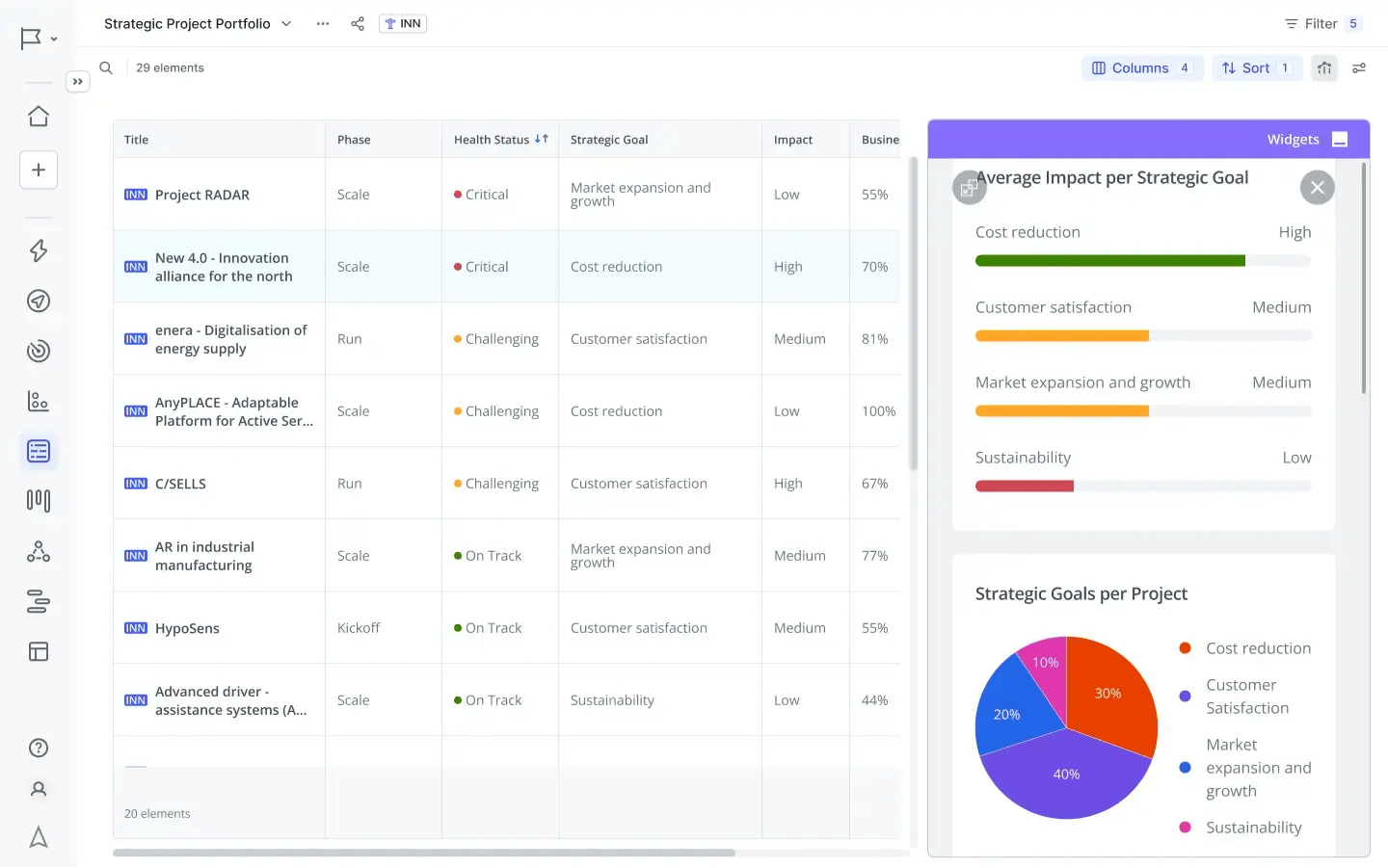
Exhibit 1: Real-time dashboards in the ITONICS platform used for portfolio analysis
The best dashboards do three things:
- Show real-time data across all strategic initiatives
- Highlight deviations from the plan before they become critical
- Enable informed decision-making without requiring context-switching between tools
Done right, a strategic dashboard gives executives the clarity to act fast. It gives teams the focus to stay aligned. It creates a shared view of strategy execution that replaces guesswork with evidence.
Five dashboard design mistakes that kill strategic agility
Bad dashboard design is more common than bad strategy. A flawed dashboard makes sound strategic plans invisible. Here is where most organizations go wrong.
Showing data instead of insights
Raw numbers do not drive decisions, but context does. A dashboard that displays 47 active strategic initiatives tells leaders nothing. A dashboard that shows 12 initiatives on track, 8 at risk, and 3 critically delayed creates immediate clarity.
Design for actionable insights, not data volume. Every visual element should answer a decision-relevant question.
Tracking the wrong key performance indicators
Many organizations measure activity instead of outcomes. Task completion rates and meeting counts are not key performance indicators for strategy execution. They measure busyness, not progress.
Effective strategic dashboards track outcome-based metrics: percentage of strategic objectives achieved, budget-to-value ratio per initiative, and time-to-decision on blocked work. These metrics connect performance to strategic outcomes.
Building dashboards for executives only
Strategic alignment requires that teams understand progress, too. If only executives could see the dashboard, teams continue executing in the dark. They cannot self-correct because they cannot see the bigger picture.
Build dashboards that serve multiple roles. Executives need portfolio-level views. Teams need initiative-level views with clear ownership and status. Both perspectives are essential for continuous improvement.
Using static data
A dashboard updated monthly is not a dashboard. It is a report with a better layout. Real-time data is what separates a strategic dashboard from a strategy document.
When teams update progress continuously, leaders can spot trends early. They can identify bottlenecks before they cascade. They can reallocate resources while there is still time to change outcomes.
Ignoring dashboard security and data governance
Strategic data is sensitive. Resource allocation decisions, initiative performance, and strategic plans contain information that requires controlled access. Many organizations skip this step, creating dashboards that either expose too much or restrict too much.
Define access levels during dashboard design, not after deployment. Executives, portfolio managers, and team leads need different visibility without compromising data security.
How to build a strategic portfolio dashboard in 6 steps
Avoiding these mistakes is necessary. It is not sufficient. Knowing what breaks a dashboard does not tell you how to build one that works. Here is a repeatable process that does (Exhibit 2).
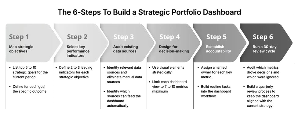
Exhibit 2: The steps to build a strategic portfolio dashboard
Step 1: Map your strategic objectives to measurable outcomes
Start with strategy, not data. List your top 5 to 10 strategic goals for the current period. For each goal, define the specific outcome that would prove success.
Avoid vague objectives like "improve market position." Replace them with measurable targets: "Capture 15% of the mid-market segment by Q3." This specificity drives the entire dashboard design.
Step 2: Select key performance indicators that measure progress
Each strategic objective needs 2 to 3 key performance indicators. These should be leading indicators, not lagging ones. Leading indicators predict whether you will hit your strategic goals. Lagging indicators confirm you already missed them.
For a strategic initiative targeting market expansion, leading indicators might include the number of qualified pipeline opportunities, pilot customer conversion rate, and partnership agreements signed. These give you time to act.
Step 3: Audit your existing data sources
Before building anything, identify where your relevant data lives. Project management tools, CRM platforms, financial systems, and operational databases all contain performance metrics that belong in a strategic dashboard.
The goal is to eliminate manual data collection. Strategic dashboards that require humans to input data weekly become stale and inaccurate. Identify which data sources can feed the dashboard automatically.
Step 4: Design for decision-making, not reporting
Use visual elements strategically. Traffic light indicators (red, amber, green) let executives scan initiative health in seconds. Progress bars show completion against the plan. Trend lines reveal whether performance is improving or declining.
Limit each view to 7 to 10 metrics maximum. Cognitive overload kills dashboards. If every metric appears equally important, none of them is. Prioritize the metrics that most directly predict strategic success or failure.
Add interactive elements that let users drill down. A portfolio-level view should link to initiative-level detail. Initiative views should link to team activity. This layered structure preserves clarity at every level without hiding important data.
Step 5: Establish accountability at every level
A strategic dashboard without ownership is just a display. For each key metric, assign a named owner. This person is responsible for updating data, explaining deviations, and escalating blockers.
Build routine tasks into the dashboard workflow. Weekly check-ins should be structured around dashboard data, not status emails. This creates a culture where the dashboard is the source of truth for strategy execution, not a supplementary view.
Step 6: Run a 30-day review cycle for continuous improvement
No dashboard is correct on day one. After the first 30 days, audit which metrics drove decisions and which were ignored. Remove the ignored ones. Add anything that repeatedly came up in conversations but was not visible.
Strategic agility requires that the dashboard itself evolves. As strategic plans shift, the dashboard must reflect new priorities. Build a quarterly review process to keep the dashboard aligned with the current strategy.
How ITONICS enables live strategy execution visibility
Building a strategic portfolio dashboard manually is possible (Exhibit 3). It requires significant time, custom integrations, and ongoing maintenance. Most organizations spend more time managing the dashboard than using it.
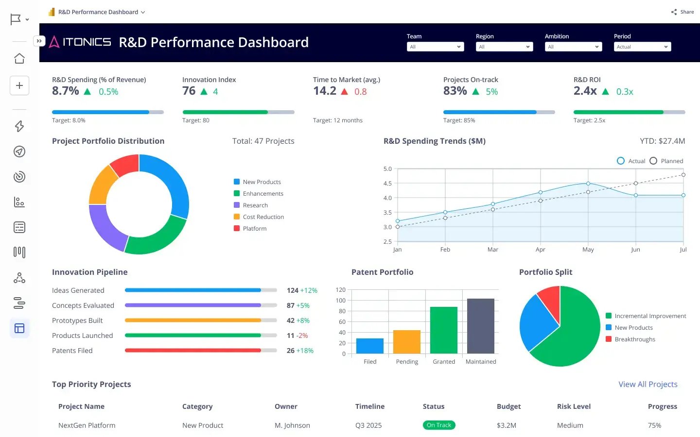
Exhibit 3: Live performance dashboards for immediate access to data
ITONICS provides a dedicated platform for strategy execution and portfolio management. The platform consolidates strategic initiatives, key performance indicators, and resource allocation into a single configurable view. Teams update progress directly in the platform. Executives get a live portfolio dashboard without waiting for reports.
The ITONICS platform connects strategic planning to execution tracking. Organizations can define strategic objectives, link them to active initiatives, and monitor performance metrics in real time. When an initiative falls behind, the platform surfaces it automatically. Decision-makers can spot trends, identify bottlenecks, and reallocate resources without switching between tools.
ITONICS also supports multi-level dashboard views. Executives see the strategic portfolio. Portfolio managers see initiative clusters. Teams see their specific priorities. Strategic alignment becomes visible at every level of the organization.
For companies managing dozens of strategic initiatives simultaneously, ITONICS eliminates the coordination overhead that consumes valuable time. Teams focus on execution. Leaders focus on decisions. The platform handles the visibility layer that makes both possible.