Most innovation leaders can describe their initiatives in detail. Far fewer can prove their impact in numbers that resonate with executives.
Boards do not fund innovation because it sounds promising, but because it demonstrates value creation, supports strategic objectives, and contributes to revenue growth.
If innovation reporting relies on activity updates, slide decks full of vanity metrics, or disconnected spreadsheets, executive confidence declines. As a consequence, decision-making slows, and resources get reallocated elsewhere.
Strong innovation reporting translates complex activities into structured metrics. It shows progress, portfolio health, and expected market impact. It connects idea generation to revenue. It links the pipeline to long-term growth.
This article outlines six visual tools that help innovation teams measure performance and present boardroom-ready insights.
Why most innovation reporting fails
Most teams report on what they did instead of what it produced. Therefore, slide decks show the number of ideas submitted, status updates list completed workshops, and budget reports track spending.
None of this tells an executive whether the innovation program is working.
The underlying problem is a measurement gap. Innovation teams track the inputs they control - hours spent, meetings held, ideas generated - because those numbers are easy to collect. Outcome metrics like revenue contribution, pipeline conversion rate, or strategic coverage require more infrastructure to produce. So teams default to what is available.
This creates a credibility problem over time. Executives see activity reports quarter after quarter without connecting them to business results. At some point, the innovation program starts to look like a cost center rather than a growth driver. Budget pressure follows.
There is also a structural mismatch between how innovation works and how standard reporting tools are built. Enterprise reporting systems are designed for repeatable, measurable operations. Innovation involves uncertainty, long time horizons, and outcomes that are difficult to attribute to a single initiative. Plugging innovation data into a financial reporting template produces misleading outputs.
Executives ask different questions: Are we investing in the right areas? What is the expected return on this portfolio? Are we ahead of competitors on the trends that matter?
Activity metrics cannot answer these questions. The right visualization tools, connected to live portfolio data, can.
1. Tables for cumulative innovation insights at a glance
A table is the most underestimated tool in innovation reporting. Used well, it gives executives a complete portfolio overview in a single view.
What tables do well
Tables consolidate data from multiple projects into one structured format (Exhibit 1). They allow side-by-side comparison across dimensions like strategic fit, resource intensity, expected return, and development stage.

Exhibit 1: Create an unlimited number of tables to bring discipline to execution and make priorities clear
The key is choosing the right columns:
- Generic status fields produce noise.
- Calculated fields like expected net present value, market impact score, or revenue contribution produce a signal.
Aggregation rows at the bottom show portfolio-level health. This shifts the conversation from "how is project X going?" to "how is our portfolio performing against strategic objectives?"
What tables do poorly
Tables struggle with relationships between data points (Exhibit 2). They show what and not why. A project scoring low on strategic fit requires context that a table alone cannot provide.
Use tables for cumulative snapshots. Combine them with other views for deeper analysis.

Exhibit 2: Customize your tables with the columns and attributes needed
When to use tables in innovation reporting
Tables work best when executives need a comprehensive view fast. Use them in quarterly reviews, portfolio steering meetings, and resource allocation decisions.
ITONICS Lists applies this format to live innovation portfolios. Teams track budget utilization, KPI performance, and strategic alignment across all active projects in one consolidated view.
2. Radar for comparing insights across a complex data landscape
A radar visualization maps multiple items on a circular axis. It is designed for comparing entities across several dimensions simultaneously.
What radars do well
Radars are ideal when you need to show how a set of technologies, trends, or competitors compares across attributes like maturity, impact, and urgency (Exhibit 3). They compress a lot of comparative data into a readable format.
In innovation reporting, radars answer questions like: Which technologies are moving from emerging to established? Which trends carry the highest urgency for our core business? How does our technology portfolio compare to the industry?
Radars also communicate directionality. Items in the outer rings signal maturity or proximity. Items in the center signal an early stage or low certainty.
/Still%20images/Radar%20Mockups%202025/foresight-keep-everything-on-your-radar.webp?width=966&height=604&name=foresight-keep-everything-on-your-radar.webp)
Exhibit 3: Provide structure to complex landscapes by mapping hundreds of data points
What radars do poorly
Radars can become cluttered quickly. When too many items appear, the visualization loses clarity. They also do not communicate quantitative precision well. Use radars for relative positioning, not exact measurements.
When to use radars in innovation reporting
Use radars when the goal is to scan a landscape and make comparative judgments. Technology radars map the maturity of your technology portfolio. Trend radars show which signals deserve attention now versus later.
Radar organizes trends, technologies, and risks by impact, urgency, and business relevance. Teams can link radar items directly to active projects, connecting foresight signals to portfolio decisions.
3. Boards to oversee pipeline movement
A board view organizes items into columns that represent stages in a process. It is the standard format for visualizing workflow and pipeline movement.
What boards do well
Boards make pipeline health visible at a glance (Exhibit 4). The distribution of items across stages reveals bottlenecks immediately. If thirty ideas sit in evaluation and two move to development each quarter, the pipeline is congested.
Boards also support stakeholder accountability. When each stage has a clear owner and defined criteria, movement from one stage to the next becomes a deliberate decision rather than a passive activity.
For idea funnels specifically, boards show how concepts progress from raw submissions to vetted opportunities. This helps executives understand conversion rates and the quality of idea generation over time.
/Still%20images/Kanban%20Board%20Mockups%202025/portfolio-govern-project-boards-2025.webp?width=2160&height=1350&name=portfolio-govern-project-boards-2025.webp)
Exhibit 4: From vision to detail to track and manage innovation projects, programs, and portfolios
What boards do poorly
Boards do not show relationships between items or resource load per stage. A board with ten items in development looks the same whether those items require ten people or one hundred.
Supplement boards with capacity data to avoid resource planning blind spots.
When to use boards in innovation reporting
Use boards to communicate pipeline health and process discipline. They work especially well in weekly team reviews and monthly portfolio updates where the focus is on movement, not metrics.
Boards support idea funnel management across stages. Teams configure criteria for each stage transition, ensuring only well-evaluated ideas move forward.
4. Matrix for limited decision situations
A matrix plots items on two axes. It is designed for situations where a decision must be made, and trade-offs need to be visible.
What matrices do well
Matrices force prioritization (Exhibit 5). By placing projects, ideas, or technologies on X-Y axes, teams must assign values to abstract qualities like strategic fit or market potential. This process surfaces disagreements early and creates a shared basis for decisions.
Common axis pairings in innovation reporting include strategic fit versus market impact, capability readiness versus revenue potential, and risk versus expected return.
A well-constructed matrix shows where resources are concentrated and where gaps exist. If every project clusters in the low-risk, low-return quadrant, the portfolio lacks ambition. If everything sits in the high-risk quadrant, the portfolio lacks balance.
.webp?width=1212&height=823&name=Opportunity%20Matrix%20with%20Sustainable%20Packaging%20(1).webp)
Exhibit 5: Matrices enable users to analyze, track, monitor, and re-evaluate a distinct set of content for decisions
What matrices do poorly
Matrices are only as reliable as the scoring behind them. If teams assign values without a defined methodology, the output reflects bias rather than analysis. Define scoring criteria before building the matrix.
Matrices also snapshot a moment in time. They do not show how positioning changes as new information arrives.
When to use matrices in innovation reporting
Use matrices when a specific decision is required: which projects to fund, which ideas to advance, which technologies to pursue. Idea matrices evaluate early-stage concepts. Opportunity matrices assess market entries. Competitive matrices position your portfolio against competitors.
ITONICS Matrix supports these decision scenarios with configurable axes and scoring logic. Teams evaluate initiatives, startups, and technologies on criteria they define, then present results in a board-ready format.
5. Roadmaps to visualize dependencies and plans
A roadmap shows planned activities on a timeline. It is the standard tool for communicating what will happen, when, and in what order.
What roadmaps do well
Roadmaps communicate execution intent (Exhibit 6). They show which projects are running in parallel, which are sequential, and where dependencies create risk. This is critical for innovation reporting because execution credibility influences executive confidence in the entire program.
Roadmaps also create accountability. When milestones are visible, missed deadlines are visible too. This pushes teams toward realistic planning rather than optimistic projections.
For connecting strategy to execution, roadmaps link individual initiatives to strategic objectives. Executives can see which projects contribute to which goals and identify gaps in strategic coverage.
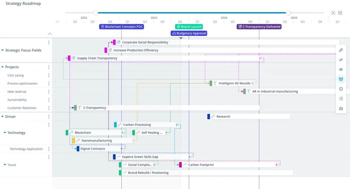
Exhibit 6: Link projects, teams, and milestones to keep execution on track
What roadmaps do poorly
Roadmaps can become overly detailed and lose their communicative value. When every task appears on the roadmap, the strategic signal disappears. Keep executive-facing roadmaps at the initiative level, not the task level.
Roadmaps also do not communicate value realization. A completed milestone is not the same as a delivered outcome. Pair roadmaps with KPI views to track both.
When to use roadmaps in innovation reporting
Use roadmaps in board presentations, strategy reviews, and resource allocation discussions. They answer the question executives most commonly ask: "When will we see results?"
Roadmap links project timelines to trends, ideas, and business intelligence insights. Dependencies are visible. Bottlenecks can be identified before they delay delivery.
6. KPI widgets to pinpoint progress
KPI widgets display a single metric prominently. They are designed for monitoring, not exploration.
What KPI widgets do well
Widgets make critical numbers impossible to ignore (Exhibit 7). A large number showing current pipeline value, active campaigns, or team engagement rate communicates status instantly. No context required.
For innovation reporting, widgets surface the metrics that matter most to executives without requiring them to read a table or interpret a chart. They answer a single question in a single glance.
Widgets also serve as leading indicators. Metrics like employee engagement rate in innovation activities or active idea submissions signal future pipeline health before the numbers show up in financial results.
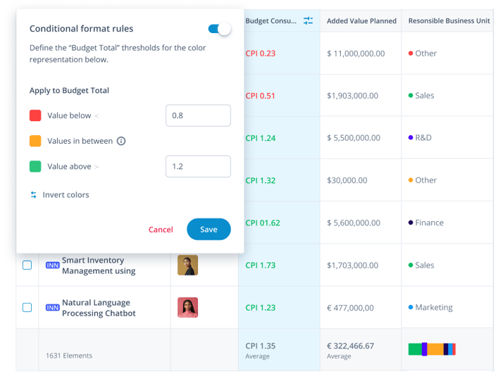
Exhibit 7: Generate interactive visualizations to illustrate specific KPIs within the portfolio
What KPI widgets do poorly
Widgets strip context. A number without a trend, target, or benchmark is difficult to evaluate. Pair each widget with a threshold or comparison period, so executives know whether the number is good or bad.
Widgets also encourage metric fixation. If a team optimizes for widget metrics at the expense of underlying quality, the metric improves while performance deteriorates.
When to use KPI widgets in innovation reporting
Use widgets on dashboards that executives see frequently. They work well at the top of portfolio reviews to set context before deeper analysis. Examples include active campaigns, pipeline conversion rate, ideas submitted this quarter, and resource utilization percentage.
ITONICS supports configurable KPI widgets that pull live data from the portfolio. Teams set thresholds, track trends over time, and surface the numbers that matter most to their specific strategic context.
How ITONICS connects these tools into one system
Most organizations run these six visualization types across separate tools: Radars in spreadsheets. Roadmaps in slide decks. Tables in project management software. Boards in standalone apps. The result is fragmented reporting that requires manual reconciliation before every meeting.
ITONICS connects all six in one platform. Three concrete benefits follow from this.
Data flows from signal to decision without manual transfer. A trend on the radar links directly to projects on the roadmap. An idea on the board connects to its evaluation scores in the matrix. No copy-paste, no version conflicts, no outdated slides.
Executive reporting becomes a byproduct of normal work. Because teams capture decisions and data inside the system as they work, board-ready views are always current. Reporting preparation shrinks from days to minutes.
Portfolio decisions happen on shared data, not competing interpretations. When every team member and every executive sees the same figures in the same system, debates about data quality end. Conversations shift to strategy, not spreadsheet reconciliation.
If your organization is ready to move beyond disconnected tools, explore how ITONICS supports integrated innovation reporting.